Get Deeper into the Insights!
In case you don't have a power BI account, get your research done with the image below.
For the interactive analysis, create account on Power BI
Visualizing Uber's Data Symphony
Embark on a creative journey through the fascinating world of Uber, where data visualisation and analysis come together to unveil captivating insights. Buckle up as we explore the intricate tapestry of Uber's data in a way that is both imaginative and engaging.
As the lines and dots crisscross and intertwine, they mirror the energy and dynamics of urban life. This insight reveals the immense scale and significance of Uber's role in shaping urban mobility and transforming the way people navigate their cities.
The visualisation uncovers the peak hours of Uber usage, showcasing the moments when the city comes alive with a surge of riders. By observing the concentration of dots during specific timeframes, valuable insights can be gleaned. This information is invaluable for Uber drivers seeking to maximise their earnings and for Uber itself in optimising its driver allocation strategies.
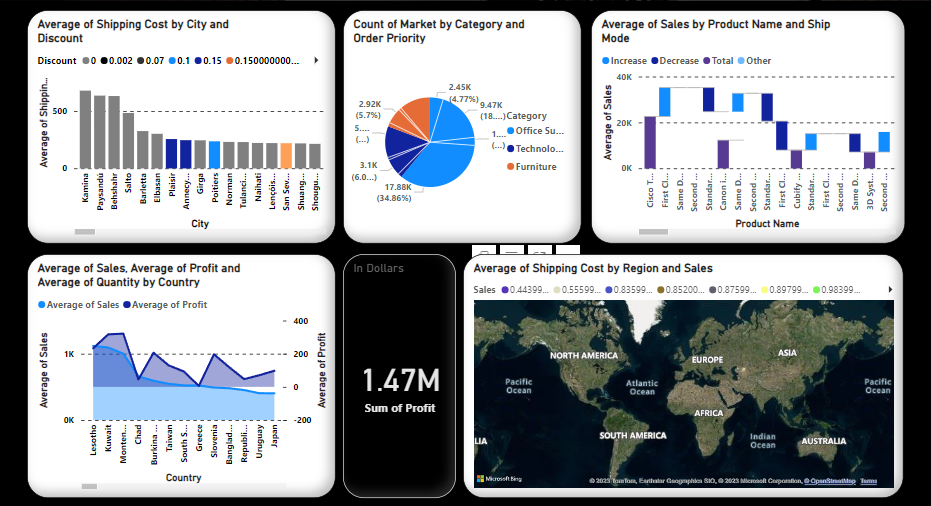
The Stacked Column Chart
A stack column chart that takes you on a visual journey through the intricate web of shipping costs and discounts across different cities.
Each column represents a city, and the height of the column reflects the average shipping cost. By comparing the column heights, you can identify cities with higher or lower shipping costs. This insight provides valuable information for businesses looking to optimise their logistics and pricing strategies based on regional disparities.
The change in the colour of the stack shows another number discount percentage on the shipping cost in the particular city mentioned.
The geographical arrangement of the columns on the chart offers regional insights. By grouping cities by geographic proximity or other regional factors, you can identify patterns and trends within specific areas. This insight helps businesses tailor their shipping and discounting strategies to specific regions, taking into account local market dynamics and customer behaviour.
Uber's Pie of the Ride
Imagine a delicious pie chart, freshly baked and ready to serve, that unveils a feast of insights by showcasing the count of markets by category and order priority. Each slice of this delectable visualisation represents a unique category, and its size corresponds to the count of markets within that category.
The varying sizes of the slices showcase the relative prevalence of each category within the dataset. This insight allows us to identify which categories dominate the market landscape and which may require further exploration or attention.
In addition to category distribution, the pie chart also includes the order priority dimension. By analysing the composition of each slice, we can discern the distribution of order priorities within each category.
By examining the pie chart, we can identify categories that have a significant market count and a high proportion of high-priority orders. These slices become focal points for further investigation and strategic decision-making.
Diving into Waterfall Chart
The varying heights of the waterfall steps unveil the relative performance of different product names. As we observe the rising and falling droplets, we gain insights into which products contribute the most to the average sales. This information empowers decision-makers to identify top-performing products, allocate resources accordingly, and drive strategic initiatives to enhance sales growth.
The vertical distance between the waterfall steps signifies the variance in average sales among different product names. Observing significant gaps between droplets highlights the disparity in performance and provides opportunities for further analysis.
Droplets that exhibit significant drops or rises suggest areas where interventions or enhancements can be made to maximise sales potential. This insight sparks innovation, inspires new marketing campaigns, and facilitates targeted improvements to drive overall business success.
Lines of Progress
By observing the trends in the average profit line, we can discern which countries consistently yield higher profit margins. Peaks and valleys in the line chart reveal periods of heightened profitability or challenges faced by different countries.
The line representing average sales unveils the performance of each country in terms of revenue generation. Peaks in the line indicate periods of robust sales growth, while dips may signify seasonal fluctuations or economic factors impacting consumer spending. This insight highlights the countries with consistently strong sales performance and those that may require strategic interventions to stimulate growth.
By comparing the average quantity line with the average sales line, we can examine the quantity-price relationship across different countries. This insight allows for pricing optimization strategies and evaluating the price elasticity of demand in different markets.
Unlock Your City with Map
As you explore the map, you notice variations in both average shipping costs and sales across different regions. Clusters of vibrant colours and patterns emerge, indicating regions with higher shipping costs and stronger sales performance.
By identifying regions with disproportionately high shipping expenses relative to sales, businesses can strategically evaluate distribution networks, transportation modes, or fulfilment centres to streamline operations and enhance cost efficiency. This insight fuels decision-making processes, driving supply chain optimization initiatives.
By overlaying sales data with shipping costs on the map, intriguing insights into pricing strategies emerge. Observing patterns of higher sales coupled with lower shipping costs may indicate regions where pricing structures effectively offset logistical expenses, making products more attractive to consumers.
Key Takeaways!
As we navigate this data landscape, let us unravel the key takeaways that emerge, painting a picture of transformation, connectivity, and innovation.
A. Complete Uber data pulsates with the rhythm of urban life, offering a glimpse into the beating heart of cities worldwide.This insight reminds us of the profound impact Uber has had on reshaping transportation in the modern era.
B. These insights signify the growing importance of convenient, flexible, and sustainable mobility options, as people embrace the idea of shared rides and the seamless integration of different modes of transportation.
C. The data offers insights into customer preferences, ride ratings, and satisfaction levels. It sheds light on the importance of personalised experiences, seamless transactions, and safety considerations. This insight underscores the significance of continuously improving customer experiences through technology, data-driven decision-making, and innovative service offerings.