Get Deeper into the Insights!
In case you don't have a power BI account, get your research done with the image below.
For the interactive analysis, create account on Power BI
The pulse of the industry with Spotify
Welcome to the Spotify Melody Universe, where data visualisation harmonises with creativity, bringing streams, artists, ranks, and songs to life in an extraordinary and captivating dashboard. Get ready to embark on a melodic journey through a world where music and visuals intertwine.
As you explore this celestial expanse, constellations emerge, each representing an artist. The size of each constellation corresponds to an artist's popularity, with the brightest stars symbolising chart-toppers and crowd favourites. You can interact with these constellations, zooming in to uncover fascinating insights about each artist, their discography, and their rise through the ranks.
Beyond the visual spectacle, this Spotify dashboard offers insights and opportunities. Discover emerging artists with untapped potential, identify musical trends that resonate with specific demographics, or gain a deeper understanding of the global music landscape. Whether you're an avid listener, a music industry insider, or an aspiring artist, this dashboard becomes your compass, guiding you to new melodies, hidden rhythms, and untold stories waiting to be heard.
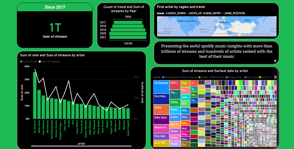
Serving the Card
Behold the extraordinary card that reveals a staggering revelation in the realm of streaming music: the sum of streams has surpassed the mythical threshold of one trillion. Prepare to be captivated by this creative visualisation as we embark on a journey of insights hidden within this astonishing milestone.
Painting with Funnel canvas
A mesmerising funnel chart, rising and expanding with an enchanting energy, showcasing the extraordinary growth of the sum of streams for a music streaming company. From the pinnacle of 100% in 2017 to the breathtaking height of 129% in 2021, this creative visualisation holds captivating insights, waiting to be unravelled.
The widening funnel layers also hint at the company's rising dominance in the music streaming industry. The increase from 100% to 129% signifies the platform's ability to surpass its initial market share and secure an even larger piece of the streaming pie. This insight highlights their competitive edge, successful strategies, and the trust they have earned from music enthusiasts worldwide.
As we immerse ourselves in this creative visualisation, it ignites our curiosity, urging us to dive deeper into the underlying factors that contributed to this remarkable journey. Exploring the insights derived from this visualisation opens doors to strategic planning, market analysis, and future growth opportunities for the company.
Map of the data discovery
Welcome to the mesmerising Global Melody Map, where music transcends borders and cultures, painting a vibrant picture of the first artists to capture hearts in each region. This creative visualisation serves as a gateway to insights into musical trends, global influences, and the power of artistic expression.
The Global Melody Map offers insights into the evolution of music genres across regions. By tracing the first artist in each area, we can observe how genres have expanded, merged, or transformed over time.
The convergence of different artists in neighbouring regions reveals a fascinating cross-pollination of musical styles. As artists traverse borders, their sounds blend and evolve, creating a harmonious interplay of genres. As we can see from the dashboard, the global artist Ed Sheeran has occupied the top position among all the artists.
Harmonizing Lines and Columns
As this captivating chart materialises, envision a symphony of lines and columns converging on a canvas of musical brilliance. The Y-axis represents both the rank and the sum of streams, while the X-axis serves as a stage for the diverse array of artists.
Analysing the fluctuation of the lines and columns allows us to detect patterns and discern streaming trends. We can identify artists whose ranks have experienced dramatic shifts, indicating a surge in popularity or the emergence of new music sensations.
Artists who maintain steady lines and columns, consistently appearing at the top of the chart, demonstrate remarkable longevity and unwavering popularity. Their enduring presence reflects their ability to captivate and engage listeners over time.
Observing the lines and columns intersecting and merging, we gain insights into the impact of collaborations and featured artists. The chart provides a visual representation of how partnerships and joint efforts influence an artist's rank and streaming numbers.
Treemap's visual symphony
Imagine a sprawling forest of rectangular shapes, each representing an artist's contribution to the sum of streams. The size of each rectangle corresponds to the artist's total streams, showcasing the giants of the music world as towering trees that dominate the landscape. The colour and texture of each shape, vibrant and varied, reflect the artist's genre and unique style.
The size of the rectangles represents the sum of streams, serving as a visual indicator of an artist's popularity and reach. The larger the shape, the greater the artist's impact and the broader their audience. This insight prompts exploration into the factors that propelled these artists to prominence, such as hit songs, viral trends, or captivating performances.
Delving into the smaller, intricately nestled shapes within the treemap uncovers hidden gems and emerging artists. These artists, though not commanding the largest rectangles, may exhibit impressive growth rates and potential for future success.
Key Takeaways!
As we delve into this vast ocean of information, let us explore the key takeaways that emerge, woven together in a creative tapestry of understanding and appreciation.
A. The complete Spotify data reveals an expansive world of musical diversity. From chart-topping hits to obscure gems, the dataset spans a rich spectrum of genres, artists, and cultures.
B. The complete Spotify data reflects the seismic shift in music consumption brought about by streaming platforms. It highlights the exponential growth of online streaming and its increasing dominance over traditional forms of music distribution.
C. These insights provide valuable information for artists, labels, and marketers to tailor their strategies, target specific markets, and engage with listeners on a personal and cultural level.