Get Deeper into the Insights!
In case you don't have a power BI account, get your research done with the image below.
For the interactive analysis, create account on Power BI
Decoding Mercedes-Benz Analysis
Welcome to the Mercedes-Benz Sales Dashboard! Get ready to embark on a visually captivating journey through the realm of sales data. Buckle up and let your imagination take flight as we explore the creative and exciting world of data visualisation.
A dashboard that exudes elegance, mirroring the sophistication and luxury of the Mercedes-Benz brand. As you step into this virtual showroom of data, the first thing that catches your eye is a sleek, dynamic graph resembling the iconic curves of a Mercedes-Benz car. This graph represents the overall sales performance, with a smooth line that undulates like a thrilling ride on the open road. The colour palette, inspired by Mercedes-Benz's signature silver and black, adds a touch of class to the visual display.
But this is no ordinary graph. As you interact with it, the lines transform into shimmering highways, pulsating with vibrant lights that correspond to sales figures. Let's talk about each visual from the dashboard and extract a story out of it.
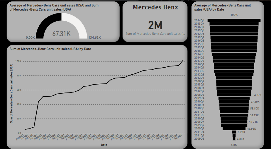
Gauging the Road
As you enter the dashboard, your eyes are immediately drawn to a mesmerising circular gauge, reminiscent of a finely crafted Benz steering wheel. But this gauge is more than just a beautiful display. It is a gateway to understanding the pulse of the sales ecosystem. As the needle glides from left to right, it reveals valuable insights about the average sales figures.
In the early years, the needle hesitates, struggling to gain momentum. It reflects the aftermath of the global financial crisis, as the American automotive market faces headwinds. But as the story unfolds, a tale of resilience and growth emerges.
In the period of Benz from 2008 to 2016, each quarter, the company has made total sales of 134.62K pieces. That doesn’t sound like a good number, but it is a luxury because it sells quality over quantity.
As our story nears its climax, we encounter a pivotal moment—a dip in sales around 2009, in many quarters when the company didn’t make even a hundred sales. It included 2009 Q3, 2011 Q1, 2011 Q4, 2014 Q3, 2015 Q3. The needle falters, reminding us that the road to success is not without obstacles. But Mercedes-Benz does not falter. Instead, the brand regroups, adjusting its strategy, and learning from this setback.
The gauge serves as a reminder that data storytelling is not just about numbers and visuals. It's about weaving narratives, generating insights, and illuminating the path to success. From the data, it is clear that the maximum of the sales made by the company are in the first and the third quarter. This will make you know about the good time to either buy the benz or make profit from the benz.
From Lines to Luxuries
Once upon a time, in the vast landscape of the United States, a story unfolded through the graceful dance of a line chart. This chart wove a tale of the sum of unit sales for a beloved brand, spanning the years from 2008 to 2016. Let's embark on this data-driven adventure and extract insights from the narrative it unfolds.
As we gaze upon the line chart, imagine the X-axis as a timeline, stretching from the depths of the economic recession in 2008 to the subsequent years of recovery and growth. The Y-axis represents the sum of unit sales, symbolising the brand's presence and popularity within the American market.
The line chart's peaks and valleys reveal intriguing patterns and insights. Notice how the line climbs steadily, with occasional spikes and dips, like a rollercoaster ride of sales performance. Each peak represents a surge in unit sales, driven by factors such as new product launches, strategic marketing campaigns, or a surge in consumer confidence.
Let's pause for a moment and zoom in on one of those peaks, the highest point on our journey. What story does it tell? Perhaps it corresponds to a breakthrough innovation—an iconic model that captivated the imagination of the American public. Or it could be the result of a brilliant marketing campaign that struck a chord with consumers, propelling sales to new heights, every alternative quarter.
Reflecting on this data-driven tale, we uncover invaluable insights. We witness the brand's resilience in the face of adversity, its ability to adapt and thrive. We identify the key drivers behind sales peaks and explore the factors contributing to dips. Armed with this knowledge, we can chart a course for the future, leveraging the lessons learned and seizing new opportunities.
Mercedes Benz has gone through both crests and troughs in the sales journey, just like any other business, but the overall performance shows a hike in the profit for the company and is absolutely a good option for the investment. So, investors, what more story are you waiting for in terms of monetary profit?
Funneling Growth
Imagine the funnel chart rising before your eyes, like a majestic tower ascending to the skies. Its layers, resembling the graceful curves of a Mercedes-Benz vehicle, symbolise each year from 2008 to 2016. The chart stands as a testament to the brand's presence and performance in the American market.
As we delve into this chart, let us begin at the widest part of the funnel, representing the year 2009-11. This is a period shrouded in mystery, as the financial crisis casts a shadow over the automotive industry. The funnel narrowed the most, symbolising the challenges faced by the brand during this turbulent time. But within the depths of adversity, a glimmer of hope emerges.
Along this journey, we unearth valuable insights. By examining the differences in layer widths, we gain a deeper understanding of the brand's performance over time. For instance, a sudden surge in narrowing layers might indicate a groundbreaking model launch, a successful marketing campaign, or an innovative technological advancement.
In this magical journey, the funnel chart's enchantment lies in its ability to evoke emotions and spark curiosity. It beckons us to dive deeper into the underlying factors that influenced unit sales, encouraging us to ask questions and seek answers. Was it the allure of a sleek sedan or the allure of an adventurous SUV that captured the hearts of American buyers? Did the brand's commitment to innovation and luxury play a pivotal role in its ascending path?
The investors might get to know a lot about the investment in the Benz based on the time period the funnel gets narrower. The least is the 4.8% of unit sales this company has made, and the time period is specified in the chart in detail.
Dear Entrepreneurs, if your brand is going the same way, don’t lose hope. Just work and wait for the Benz 2016 kinda timing for your brand!
Key Takeaways!
A. Regional Performance: Investors and entrepreneurs can identify regions that consistently exhibit strong sales growth. This insight helps in determining areas to focus on for market expansion or investment opportunities.
B. Performance Benchmarks: Investors and entrepreneurs can assess the brand's performance against industry standards or set targets. By comparing the gauge readings to predefined benchmarks, they can evaluate the brand's market share, growth trajectory, and competitiveness.
C. Market Share Analysis: By examining the variations in layer widths within the funnel, investors and entrepreneurs can gauge the brand's market share in specific time periods. This insight aids in assessing the brand's competitive positioning and identifying potential areas for growth or market penetration.